|
John's Blog
Monday, June 13 2016
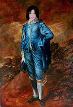
I posted this blog right after I completed the painting, Michael Jackson as Blue Boy. However I have received so many comments and questions about it I've decided to repost it now. Hope you find it informative. I hope you will take the time to read below or at least skim over it and look at the progress drawings. Or you can go to the Completed Painting of Michael Jackson as Blue Boy. My painting of Michael Jackson as The Blue Boy was inspired by my fascination with the unending media attention given to Mr. Jackson's death. If you took the time to read the page with the larger image you would have seen the history of the original painting by Gainsborough as well as some of my thoughts about my version. If not I am repeating them here. Because the "The Blue Boy" is so famous, (At one point almost everyone's grandmother had a copy hanging on the wall. I know mine did.) I think it fitting to portray Michael Jackson as an updated version. Why? The boy originally was painted in very fancy dress not worn by his contemporaries. He was thought of as a "pretty" boy, and his image has become one of the best known by even those who know nothing of art. The painting and Michael have caused extensive media coverage and controversy..The painting and the man became larger than life with both always in the news. One other thought crossed my mind as I was painting. The controversy in 1922 was not about the young man in the painting but of the icon it had become. The newsworthiness of Jackson is now more about the controversial icon he was or is rather than the musical wonder he was at one time.
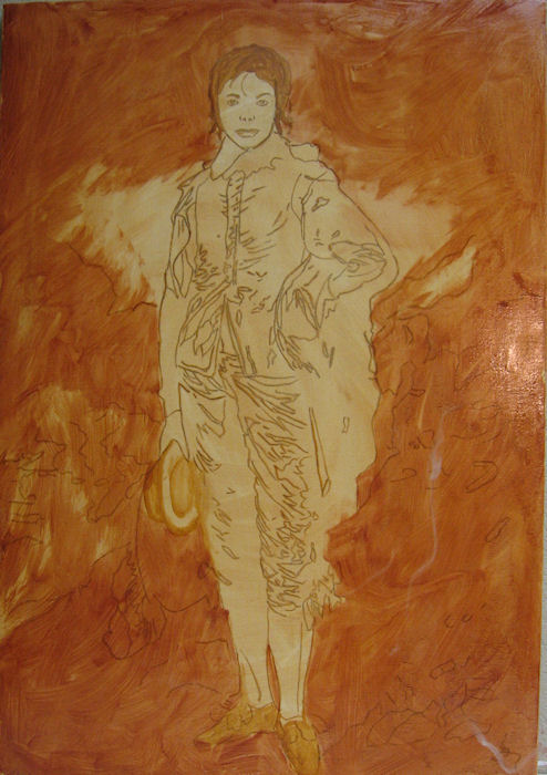
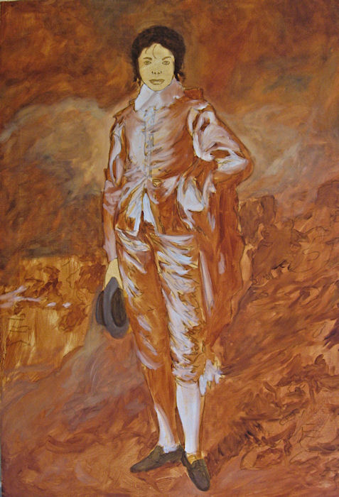
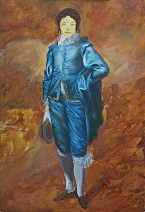
What I will attempt to do here is explain my painting process and some of the thoughts I ha  d as I worked. Much of this is in technical, painter terms. You may find it boring, but I'm asked by many of my followers, both painters and partons, to do this when I can. I'm told it gives a better and deeper understanding of my work. (Then there are those who say, "Just shut up and paint. Let the image do the talking.") d as I worked. Much of this is in technical, painter terms. You may find it boring, but I'm asked by many of my followers, both painters and partons, to do this when I can. I'm told it gives a better and deeper understanding of my work. (Then there are those who say, "Just shut up and paint. Let the image do the talking.")To begin I used the Internet to research as many photos as I could of Michael at various stages of life and in various clothing. I admit, I didn't know much about him when I started. I actually knew much more about the original painting then I did of Michael. I knew I wanted to add the face, glove, hat, shoes entrance to Neverland but wasn't sure exactly which face I wanted to put on it. At first I had decided to use one from what might have been is more productive time and where, I think, he was his most good looking. Finding photos of the original Blue Boy painting was, of course, very easy. Once I had all the reference material I did a number of sketches until I had the drawing, full size, 32 x 22 I wanted. I stretched a canvas of Belgian linen and prepared it for the initial toning of the ground. I toned this ground with raw sienna. I then traced the drawing on the canvas. The next step was to go over the tracing with darker raw sienna and block in the background with more of the same and some burnt sienna.  You can see here where I had chosen a much younger face than the one I ended up painting. These stages dry quickly so I can paint again the next day. The next stage was to add some highlights of a weak white and the shadows with a deeper burnt sienna. Here I also added some darks for the hat, shoes and hair. Once I have this much done I can sort of "see" what I want to do and how to proceed. Up to this point even if it might look as if I were very sure of what was going to happen I often find when I get here something very basic is very wrong. Not the right size canvas, wrong size image for that canvas, lighting balance or center of focus will never be right. Of course, in this case, I really didn't have to worry too much since all the real work was done for me by Mr. Gainsborough.  Next comes what I call the local color. Surprise! Blue. From the beginning I had intended to make my version more colorful than the original and use a brighter blue as well as more warm tones in the background. I wanted more color and chromatic contract than in the original. The original is rather muted but I admit I have never really seen the original in person so I'm not sure what it is for real. In any event I put in the blues using prussian blue, (one of my favorites). I also worked on the background here using combinations of prussian blue, burnt sienna and yellow ochre. I was still keeping things light and mostly just defining shapes and shadows. When this stage was dry and ready to proceed I started to worry about the face. I even went so far as to print various photos the exact size and cut them out and paste them on the painting. I change them over and over not quite sure what I wanted. I finally decided on the later face with the longer hair or wig. I felt it added more drama to the image with that sad, almost sterile face with so little expression. I also think it helped to show what I thought was so sad about all this. Here was a very talented man, capable of and did dominate the musical entertainment world for so long and was loved by so many but still all his life felt there was something wrong with his appearance, never feeling he was what he wished to be.  With the next stage I worked on bring up the background to a stage nearing completion. I added the little Neverland entrance brought down the colors of the sky and the land a great deal with the same colors as earlier and I added more depth to the clothing with more of the same colors and some Ultramarine added. The shoes hat and hair were deepened making a black from the blue and burnt sienna. Very little white was used. Only a bit in the sky and some weak versions for the highlights of the gown and socks. The most white was used in the creation of the sequined glove. With the next stage I worked on bring up the background to a stage nearing completion. I added the little Neverland entrance brought down the colors of the sky and the land a great deal with the same colors as earlier and I added more depth to the clothing with more of the same colors and some Ultramarine added. The shoes hat and hair were deepened making a black from the blue and burnt sienna. Very little white was used. Only a bit in the sky and some weak versions for the highlights of the gown and socks. The most white was used in the creation of the sequined glove.Once the face was roughed in using my traditional flesh colors, vermillion, yellow ochre and cerulean blue with white I added some of the details of the eyes with my made up black and a deep brown from the same colors. At this point and from here on out most of the work is very subtle using glazes. For those interested, many paintings are done with the colors applied thick enough so other colors don't show through them. This gives a painting a very strong and solid look. Other painters, such as myself, prefer to use what are called glazes. This is the application of very thin layers of transparent color over other colors to create a new color by way of the eyes interpretation of the optical effect. Many if not all of the old masters used this and some such as Leonardo used it almost exclusively. To see the final image please go to this page of Final Image of Michael Jackson. There you can also see details of the face and Neverland. Comments:
|
Site Mailing List
Sign Guest Book
View Guest Book
The portraits, paintings, prints and art classes of John Entrekin
John Earl Entrekin
Site designed and managed by Midair-maintence. All content is copyrighted by John Earl Entrekin, 2011
Build your own website
WebStudio Website Builder
WebStudio Website Builder


